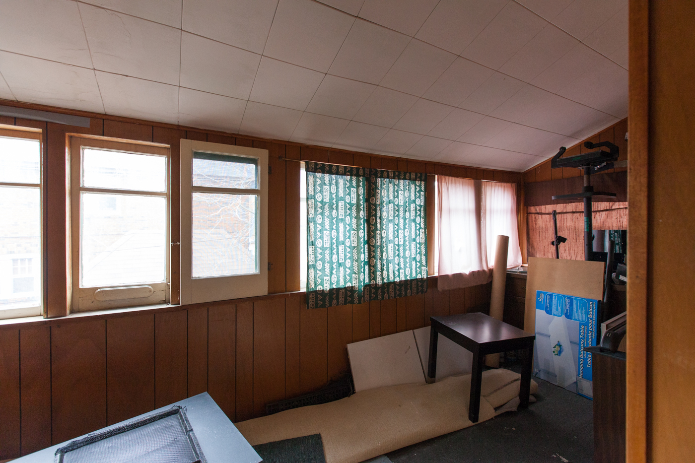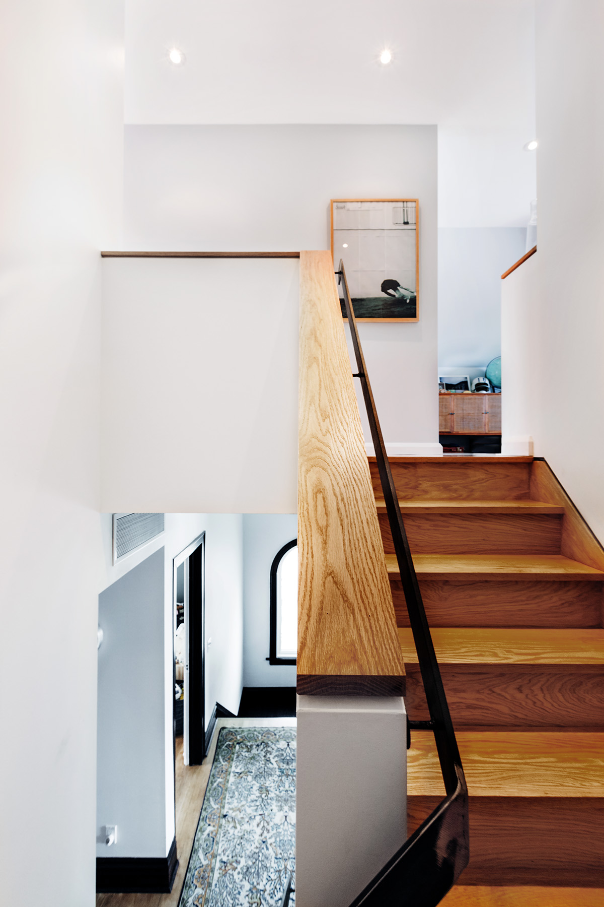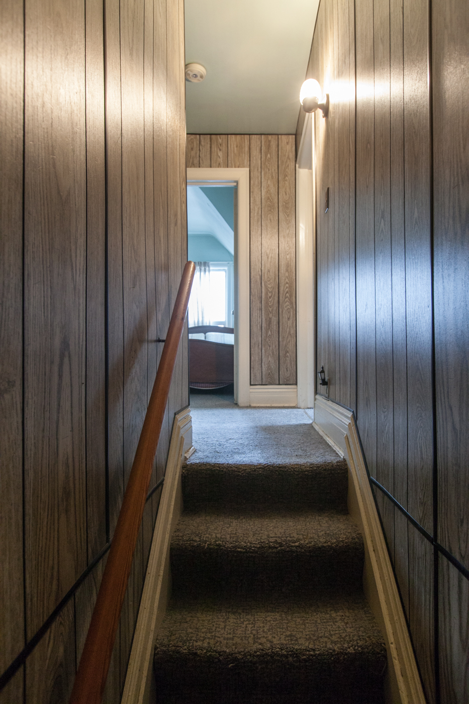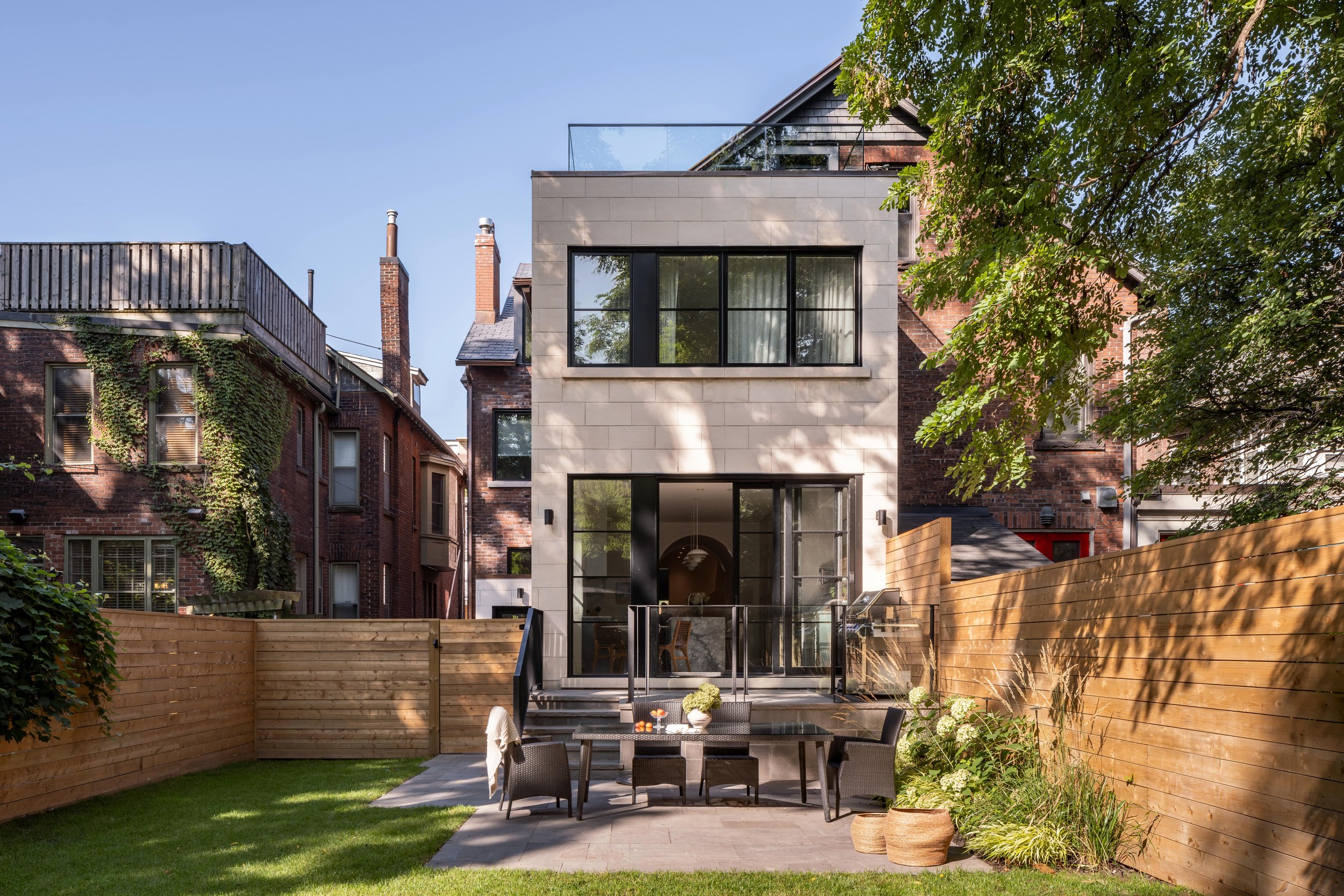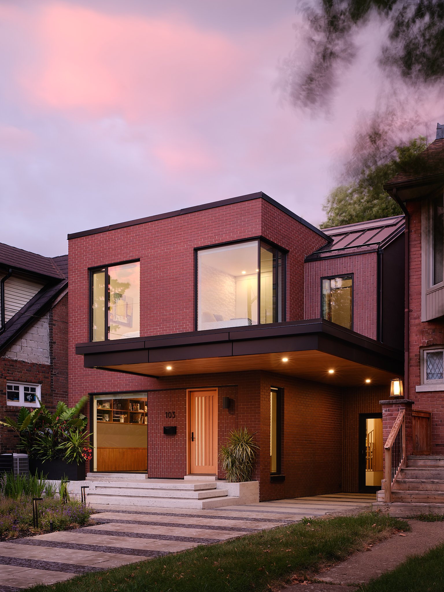
The Rusholme renovation and addition was a careful balancing act, preserving the original character and heritage features of this eclectic 100 year-old Victorian home, while introducing new circulation, spaces and conveniences for 21st century living.
Rusholme
Location: Toronto
Status: Complete
Year of Completion: 2015
Type: Residential; Renovation, Addition
Credits
Structural Engineer: Blackwell
Builder: TAF Built
Photography: Cindy Blažević
Press
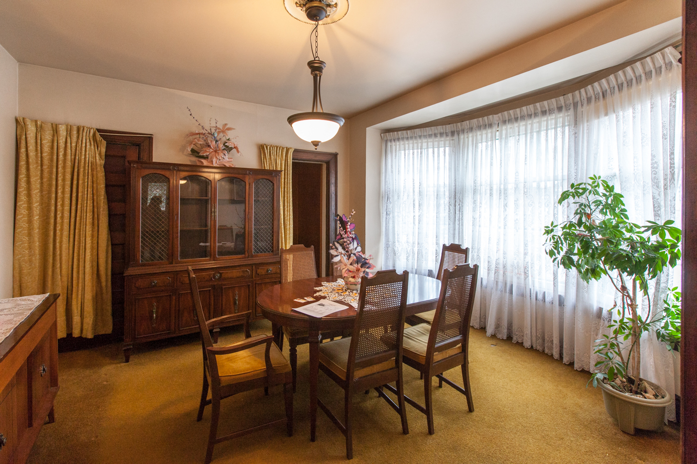
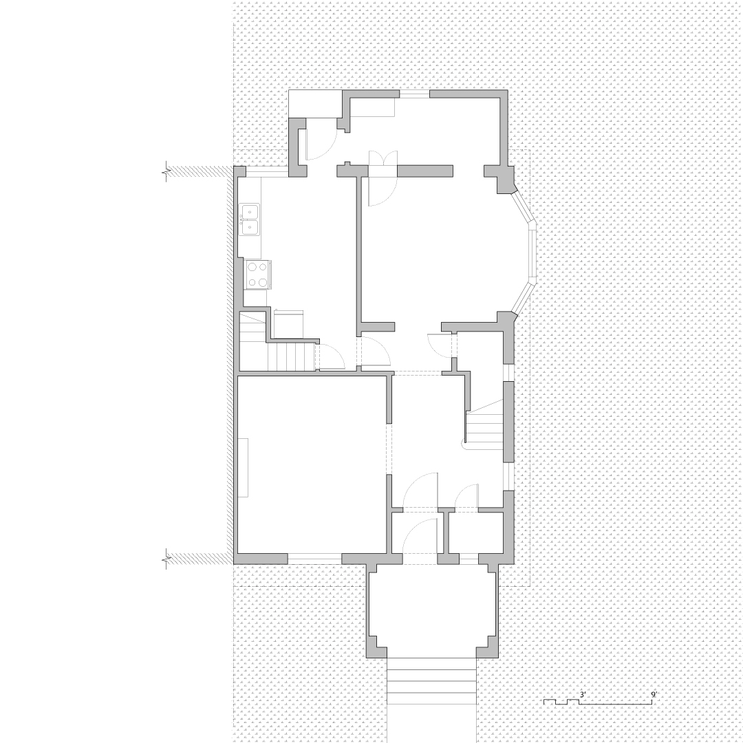
Located on a corner lot just west of downtown Toronto, the Rusholme house was an eclectic 100 year-old residence in need of some much needed TLC. Like many older homes in the city, the house had undergone a number of haphazard changes throughout its history, undermining its historical elements and resulting in mismatched interiors, outdated finishes and an awkward circulation scheme.
From the beginning, the objective was not to restore the home to its original state, but rather to re-value its best qualities while introducing contemporary notions of space and circulation. This underlying mandate dictated a design and construction strategy characterized by a series of precise, almost surgical, interventions throughout the house. The result is an exciting and playful mix between old and new, where tradition and modernity meet in unexpected ways.
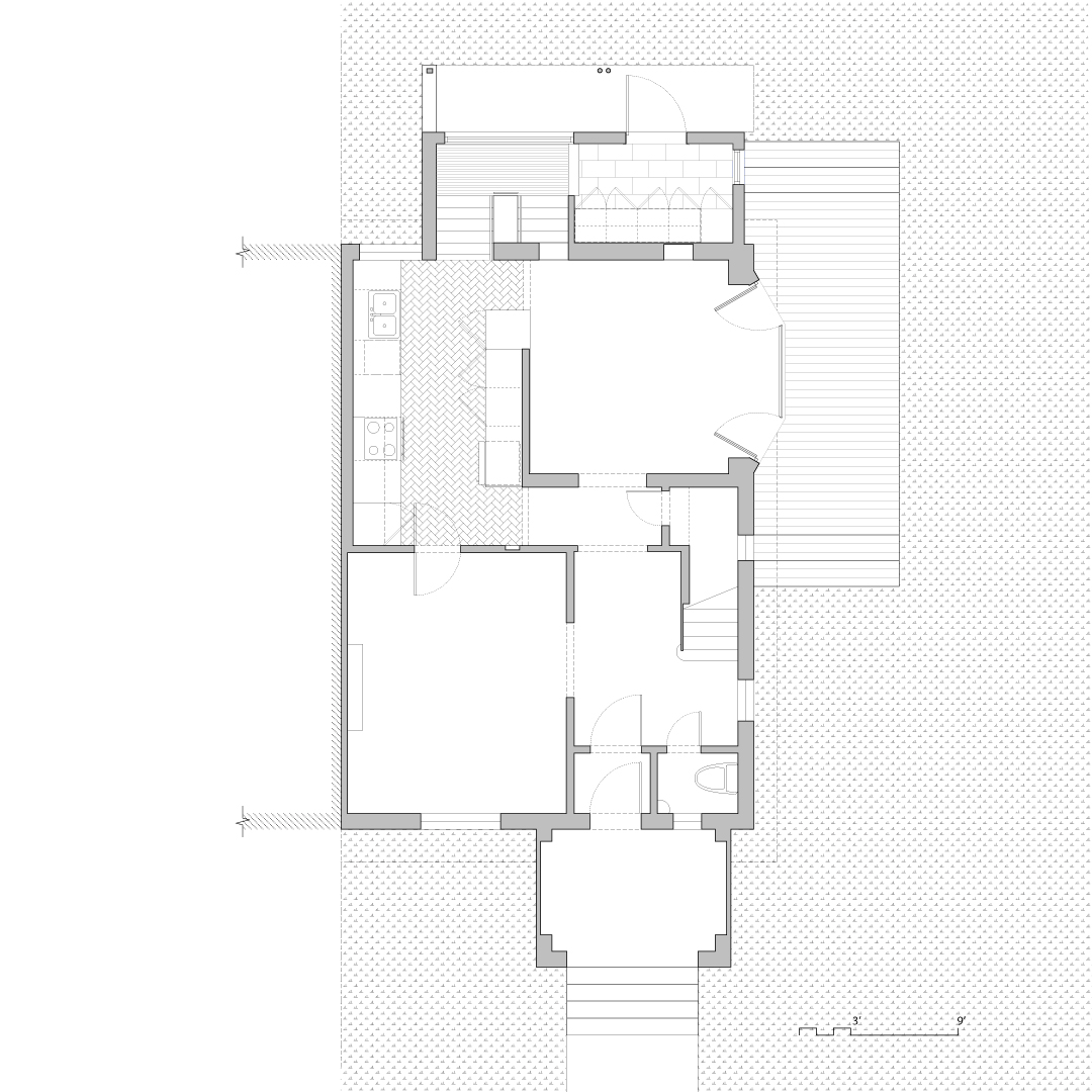
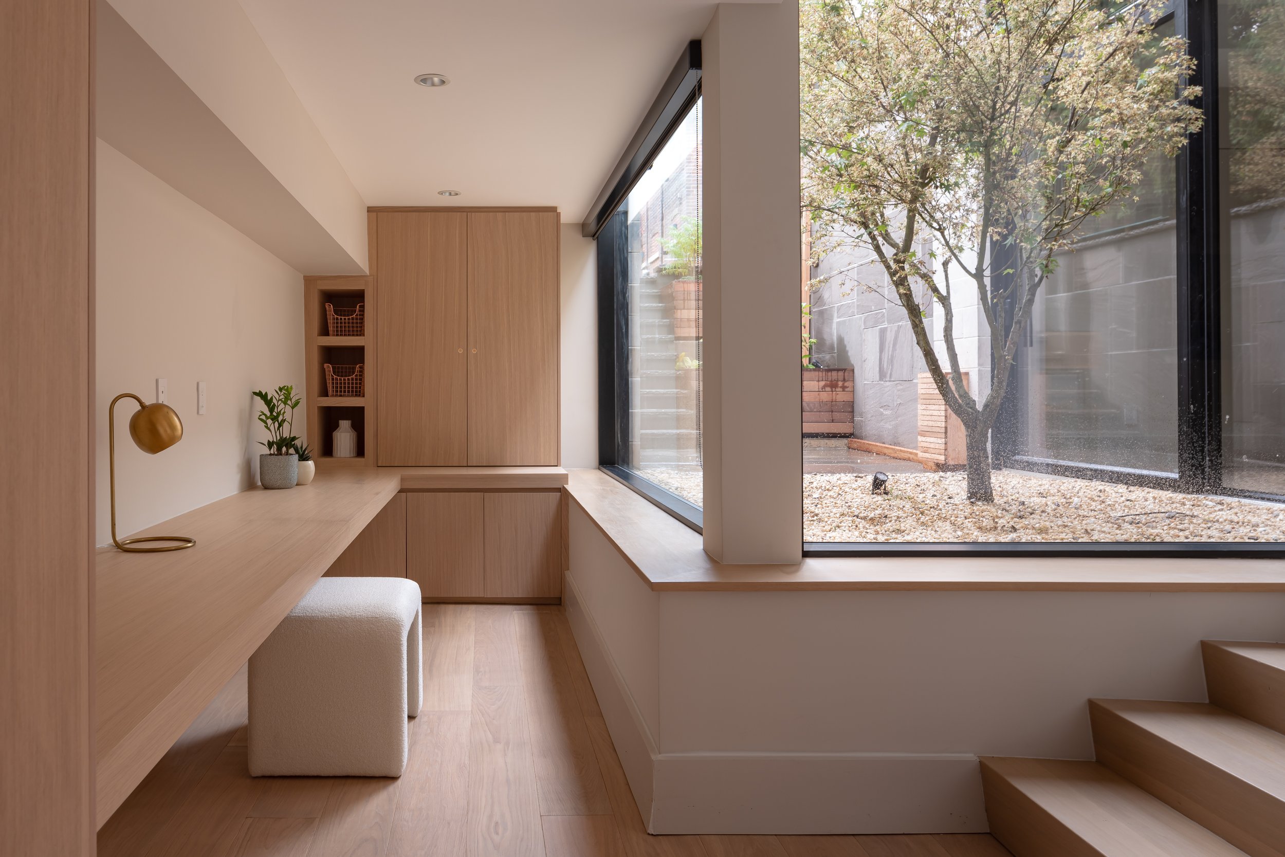
Instead of a trend-driven open plan, the ground floor has been kept as a series of distinct, self-contained rooms – however, circulation and sense of openness have been improved by relocating the basement staircase, inserting new doorways and openings, and widening existing circulation. Storage has also been addressed, with the antiquated servery transformed into a practical but elegant mudroom.
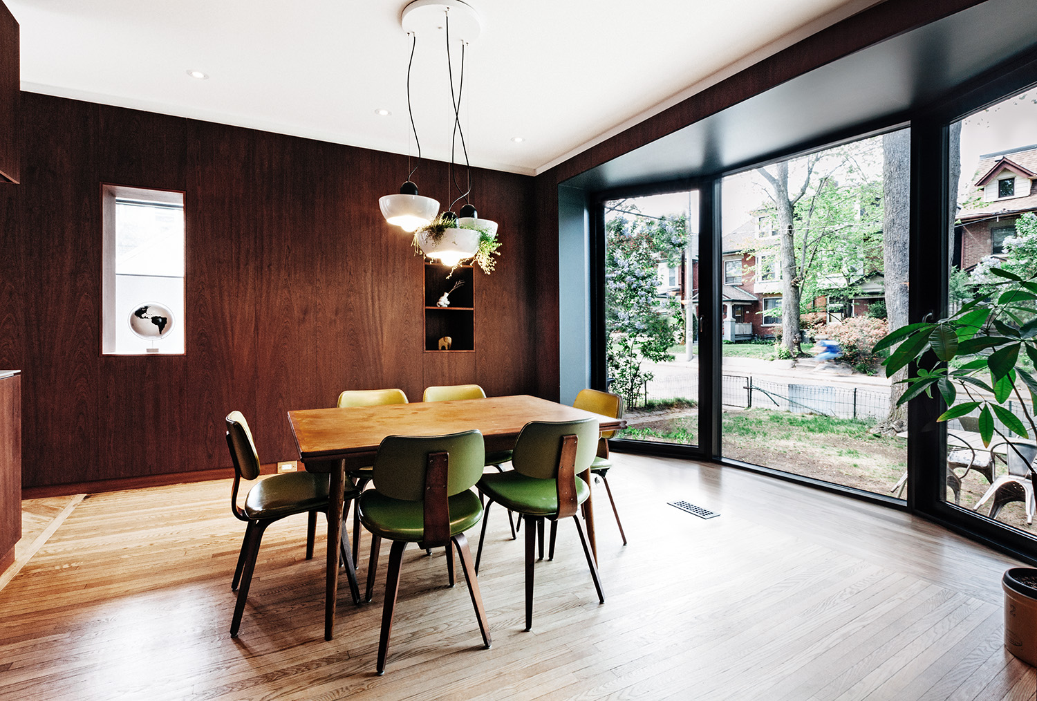
In the dining room, the form of the traditional bay window was kept, but has been fully transformed into a walkout with floor-to-ceiling doors that open to an outdoor deck and garden. This small but effective move radically changes the relationship of the house with the surrounding landscape, allowing a more fluid relationship between indoor and outdoor living.


